


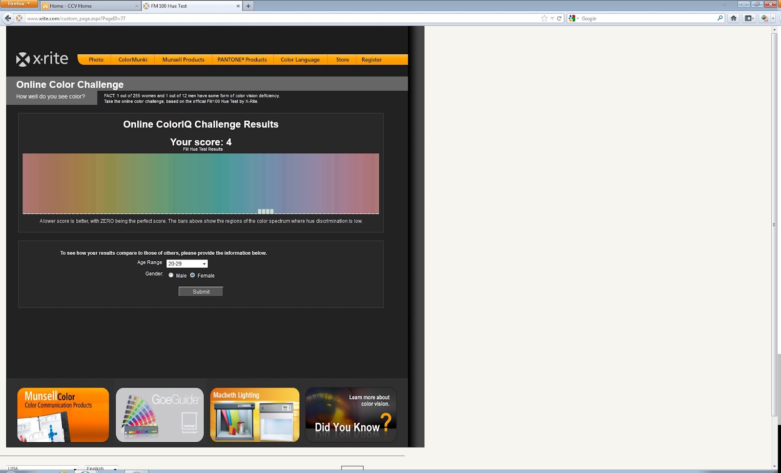


 I thought this test was so cool! I took it once, and scored an 8, and then when I did the screen shot I exited out, little to my knowledge I forgot to hit alt, AHH! So, I retook the test and scored a 4! Pretty awesome!


 I chose this photo because I thought it was really neat. I think that it definitely uses exaggerated size. The brightness of the bottle on the left is where your eye first lands, and then it follows horizontally across the bottle and then to the man jogging below the drop of water.
 I saw this photo on facebook about a month ago and after
 I enjoyed this assignment, it was fun going around my house trying to think of fun, different textures I had. From left to right, I used corks from wine bottles, a scarf, sugar, my make up brushes, cotton balls, pepper, beads from a key chain, aluminum foil, the fur trim of a santa hat, money, paper towel, a terry cloth, dead leaves, my leather belt, and a cord.


 With this project, I used digital media to construct my balance. I used basic silverware one would find in the kitchen. In my first piece, I made it very uniform in straight ups and downs, with two slight diagnols.
  In this second part, I used the basic cut outs, and still included the up and down, but also the diagnols more. I believe that both images are well balanced.
 The bright red flower is the focal point of this image I took. The fact that the background of the flower is blurred, the red, which is a loud color anyways, grabs ones attention immediately. I took this photo last spring.


 The Creation of Adam by Michelangelo is a famous painting that shows emphasis by placement. The two men are on opposite sides of the image, but their arms reach towards the center with their fingers almost touching at almost the center of the painting. I found this online by searching Michelangelo.
 This is a good example of One Element, as well as advertising. The women in the image appears to be wearing nothing but the jewelery around her wrists, which immediately gives off the message of this being an add for jewelery. The color of the jewelery also grabs the attention of the viewer. I found this by searching magazine ads.
 This painting does not have a focal point. This artist emphasized on the entire surface and it looks like there was an even distribution of the colors used in this image. I found this by searching no focal point.


